| Palettes Lesson by blue |
|
Palette Tutorial This isn't a complete tutorial; it's only some tips on some colors that many dollers seem to have trouble with, and some colors that I think I do particularly well. Feel free to use any of the palettes offered in this tutorial, though I would appreciate a link if you do. This tutorial covers:
YELLOW Yellow is the color that dollers seem to have the singularly hardest time with. Ninety percent of the time, when I see a doller working with yellow, it makes me cringe inwardly. Personally, I use hue and saturation shifts in my work 100% of the time. They help any palette to look less 'muddy' and more rich. However, it is the most easily apparent in yellow. Observe the following palette:   This palette is all the same saturation, and all the same hue; all I've changed is lightness to create the different colors in the ramp. Yes, it looks yellow -- but note how, in the shadows, it also looks dirty. It doesn't look bright and sunny the way yellow should; instead it looks a bit like, well, rotting banana. In comparison, look at this palette:   Here, I've put a hue shift to make the palette redder and lower saturation in the shadows. As a result, the palette looses that dirty feel to it. It looks more natural, more real, and brighter. Look at the two beside each other: Look at that difference! It's not negligible, it's a vast improvement. On top of this, I want to give a little explanation about the importance of all your palettes going well together. It seems to be a popular practice for dollers to either use other peoples' palettes, or create different ramps for each article of clothing, that don't seem to have any interaction with each other at all. This does not make for good composition. It's always important to consider color scheme in your dolls, and to make your palette cohesive as a whole. This is important for two reasons. First of all, dolling is ART. Yes, it's art. Some people view it as a hobby, but it is still an art form and should be treated as such. In art, it's not just a matter of making each part well indivitually, it's about making the piece work as a whole. Color scheme should be taken into consideration with this. Second of all, even in the real world, colors have an effect on the colors around them! Light bounces off of things and reflects onto nearby objects, for instance; or, in another case, if a room is lit by a brightly yellow light, there would be yellow hilights -- whereas if it's cast into a blueish sort of shadow, the darker shades should fade toward blue. Now you might be asking, "Well, blue, that's nice, but what the heck does it have to do with yellow!?" And my answer is: "Choose your yellow wisely." Again, this is true for every color in your palette, but it's reflected the most easily in yellow [and then again in the rest of the colors I mention in this tutorial, so be prepared for a repeating theme. XD~~] The colors around the yellow affect just how yellow it appears. Look at the following palettes for examples. 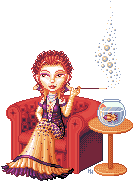  base Looking at the palette on the right, you might think that it seems more cream, or maybe even orange, than truly yellow. But put against a purple that leans closer to red, it really 'pops' and looks vibrant.   base Same deal. I just like this palette, so I included it.   base Holy crap! That yellow palette is green, isn't it? But on the doll, it really does appear to be yellow, because of the colors that surround it. Coupled with that vibrant, brilliant green, and then the beige-y color, the green aspect of the yellow fades out a bit. So feel free to play with your yellow -- don't just use FFFF00 as your starting point and lighten and darken from there. ------------------------------------------------- BLACK Ahh black. Another of the banes of dollers. For most people, the problem seems to be in getting it to appear black, instead of fading away toward grey. In this case, the trick isn't in the hue shift, or the saturation shift [though, I use these in my black palettes, too] but in contrast. Of course, the amount of contrast used depends on the texture of the object you're shading -- but generally, with black, the trick is to keep low contrast in the shadows, and high contrast in the hilights. As the palette gets brighter, the colors get farther apart. This is because black is so dark that its shadows really suck away the light, so they're very, very dark, and don't get bright until a lot of light is put on them. When I'm using black, I also [again!] generally consider the overall composition of the piece. Either I'll use the colors around it to have an effect on the way the black appears, or I'll even add a fresh color just for the sake of mixing things up a bit.  base There was a lot of purple in this piece, so I took that into consideration when making my palette. Here I went with the idea of colors reflecting onto each other, and put a lot of purple into the hilights.  base In this case, there was a lot of beige in the doll, and if the black had been neutral greyscale, it would likely have appeared blue in reality -- so I added touches of green and beige into it, to kill the cold effect it would've had on the piece and to keep everything warm.   base Here, I just wanted there to be green in the piece, because Ever likes green. Shallow? maybe a bit, but it's still reasonable.   base This palette is very low saturation in general, because the whole piece is. But note -- it is NOT greyscale. There's a definite saturation shift in the hilights, bringing them toward a pale purply-blue color. Look at how vibrant that brightest shade is! But on the shine of the shoes, where it appears, it seems a very neutral sort of grey, since the saturation shift is so slow. ------------------------------------------------- WHITE With white, like with black, the problem is in keeping the color from shifting toward grey -- and, again, the solution is in contrast! With white, however, the trick generally is to keep the whole thing relatively low contrast, and very near to #FFFFFF -- pure white. The other trick is that white is the color that is most easily influenced by the surrounding colors. Right now, I'm looking at a My Little Pony on top of my television. Yes, I have a bunch of My Little Ponies, no comments, please. This pony, however, is white with pink hair. I'm looking at it, and I can tell you quite seriously that the white is picking up the pink of the hair. It is not a flat greyscale; it's touched with hints of red. So again, for realism's sake as well as for the sake of composition, it's important not to use a flatly desaturated white palette. Take into consideration the colors around it. Generally, I'd say to keep it LOW contrast, yes, but not flat grey.   base It's very clear what I did in this first palette; I just added some very desaturated blue to the shadows, since there's so much blue in the rest of the palette. Blue is the easiest color to add to your white palette, to make it look less stark and boring. Just don't overdo it!   base It's pretty clear what I did here, too. I wanted a warm white, to go with the candle's glow and the overall feel of the piece, so I went with a somewhat beige-y white, instead of a cold, blue white. Note how beige the palette looks, all by itself -- and then how very white it seems, next to the flaming red of the hair.   base Here I added a bit more color, for the sake of composition. This is a very pink-y white, because I wanted to give her the feel of 'raspberries'. I think I succeeded. This palette doesn't look as white as all the other palettes I'm showing here; to make it look paler, I'd have to decrease the contrast some and make the shadows lighter.   base This palette's a bit wilder, isn't it? Instead of merely adding touches of ONE color into my white, I added several. Putting purple and yellow into the palette helps to bring some life to it; they sort of cancel each other out, in effect, but it still looks vibrant and alive. This is one of my favorite white palettes.   base The same deal here; the fleshy tone in there helps to cancel out the blue-green in the palette while still keeping the overall feel bright. ------------------------------------------------- DENIM Ahh denim. So many people seem to have trouble creating a good denim palette -- and once again, this is due largely to the difficulties of hue and saturation in the palette. Though, in this case, the trick lies more in saturation than hue. Before saying anything about palettes, however, I want to give a little explanation about denim. Most people, when they hear 'denim', just think it's the fabric that jeans are made of. In actuality, it has to do with how the fabric is made -- the texture, and the weave. The weave is, traditionally, blue or black threads in one direction against white in the other. Modern denim sometimes has other colors involved [I've seen pink, green, silver, all kinds of crazy colors] but it almost always still has the strands of white going in one direction. What does this mean for your doll? It means that, since there's that 0 saturation thread going in one direction, jeans are not usually vibrantly colored. They're touched with grey, since the two colors blend together. This means that your palette should NOT be a brilliant, 0000FF blue. Instead, it should be almost-grey, tinted here and there with color.  base Not only is my palette low saturation, but it actually works in a way entirely different from most palettes I create. Instead of being more vibrantly saturated in the hilights, it actually fades back out. This is because the areas that are the lightest -- the areas that stick out -- also are the areas most likely to get faded on jeans. And when things get faded, they not only get lighter, but also get greyer. My palette, if you look at it, goes from an almost-grey to an almost-blue, and then back to almost-grey. These shifts help give the really muted, neutral feel that denim has.   base These jeans are a little higher contrast, more blue, and a little lighter. But note that the palette is relatively low contrast, all the same; it just looks blue on the doll.   base by dollicious, site gone This is pretty much the same deal as the first doll, just showing it because I like the turned cuffs -- and to mention that the cuffs are much lighter than the outsides of the jeans. This is because the inside of jeans is frequently much paler than the outside, and you should take that into consideration with your doll. 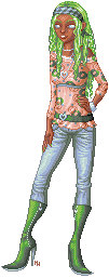  base This last palette is supposed to be for jeans that are paler, more stone-washed. They're a bit wild in palette, but show the same general idea: higher saturation in the middle, lower in the hilights and shadows, and that makes them look like proper denim. |
